Brand identity
COMPANY
ROLE
EXPERTISE
YEAR
Timeline
From research to final product design proposal in 12 weeks.
Background
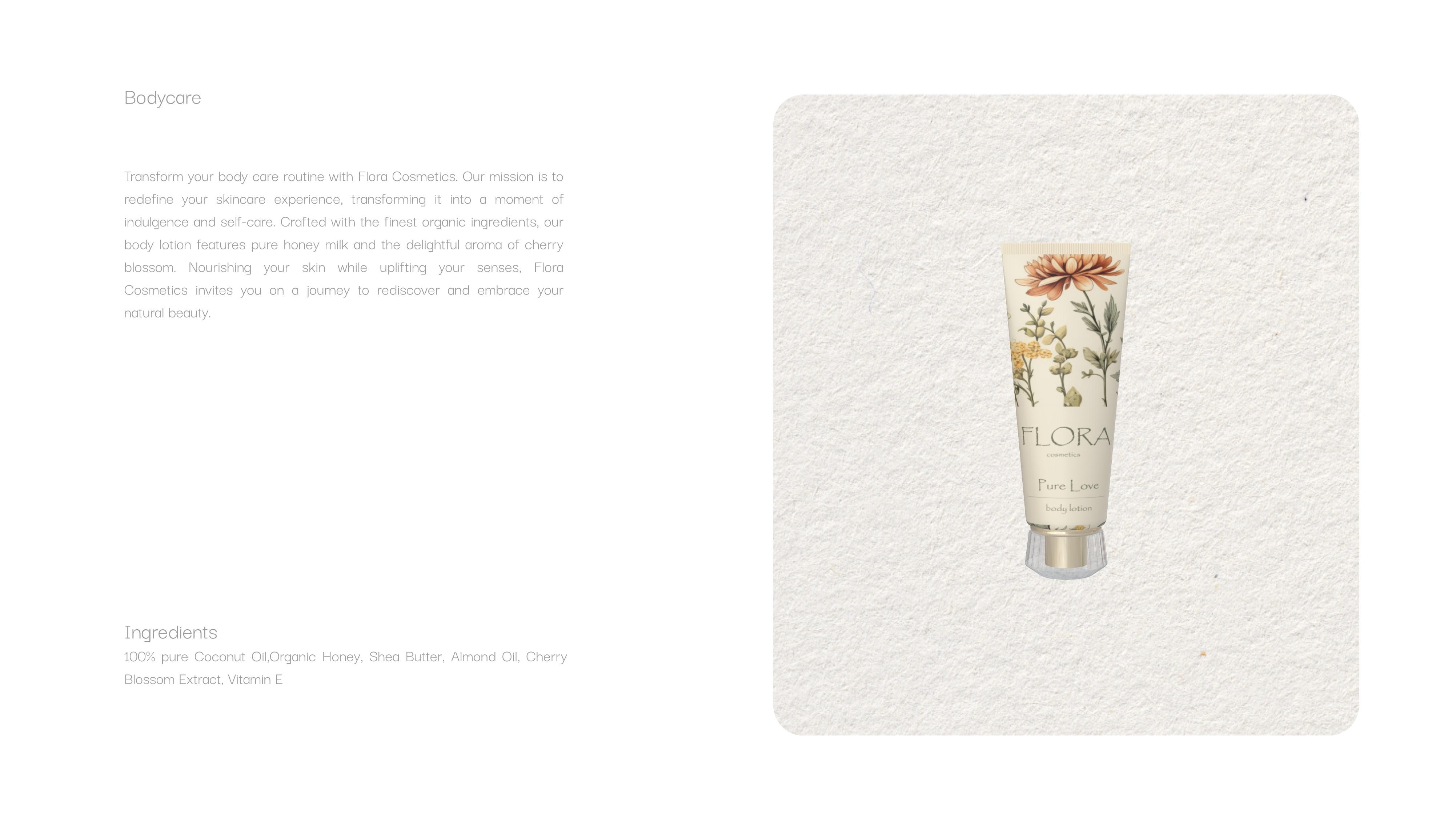
Our mission at Flora Cosmetics is to make skincare simple and enjoyable, transforming everyday routines into moments of self-care. We focus on using organic, natural ingredients like coconut oil, honey, and shea butter to create products that are kind to your skin and the environment.
Research & Planning
We conducted research to understand what our customers value most—gentle, effective, and eco-friendly products that feel good on their skin.
Our product development was guided by the goal of creating a range that is simple, pure, and made with care.
Brand Identity
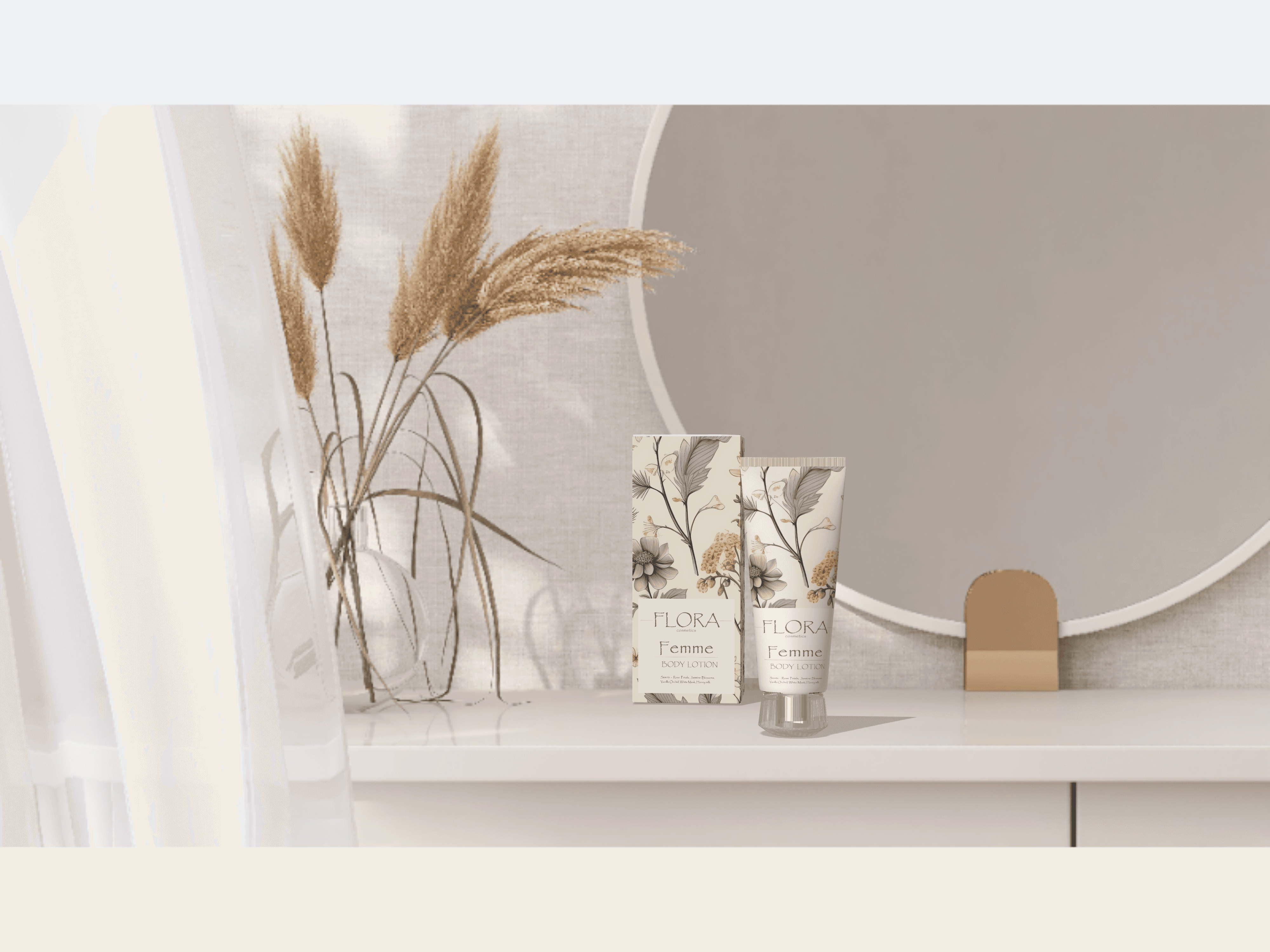
Our goal was to create a brand that felt both calming and uplifting, achieved through soft, earthy tones and clean, understated typography.
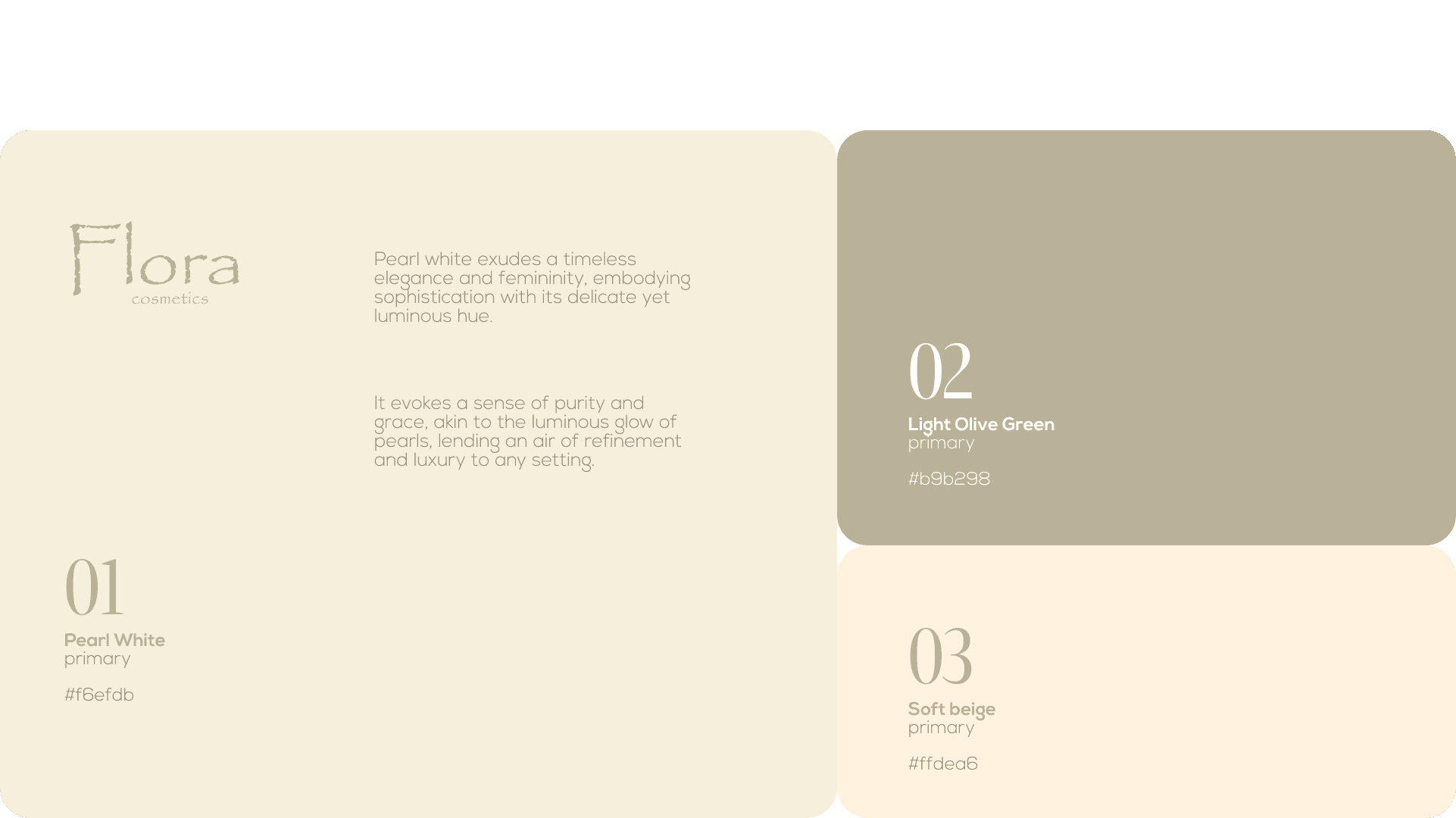
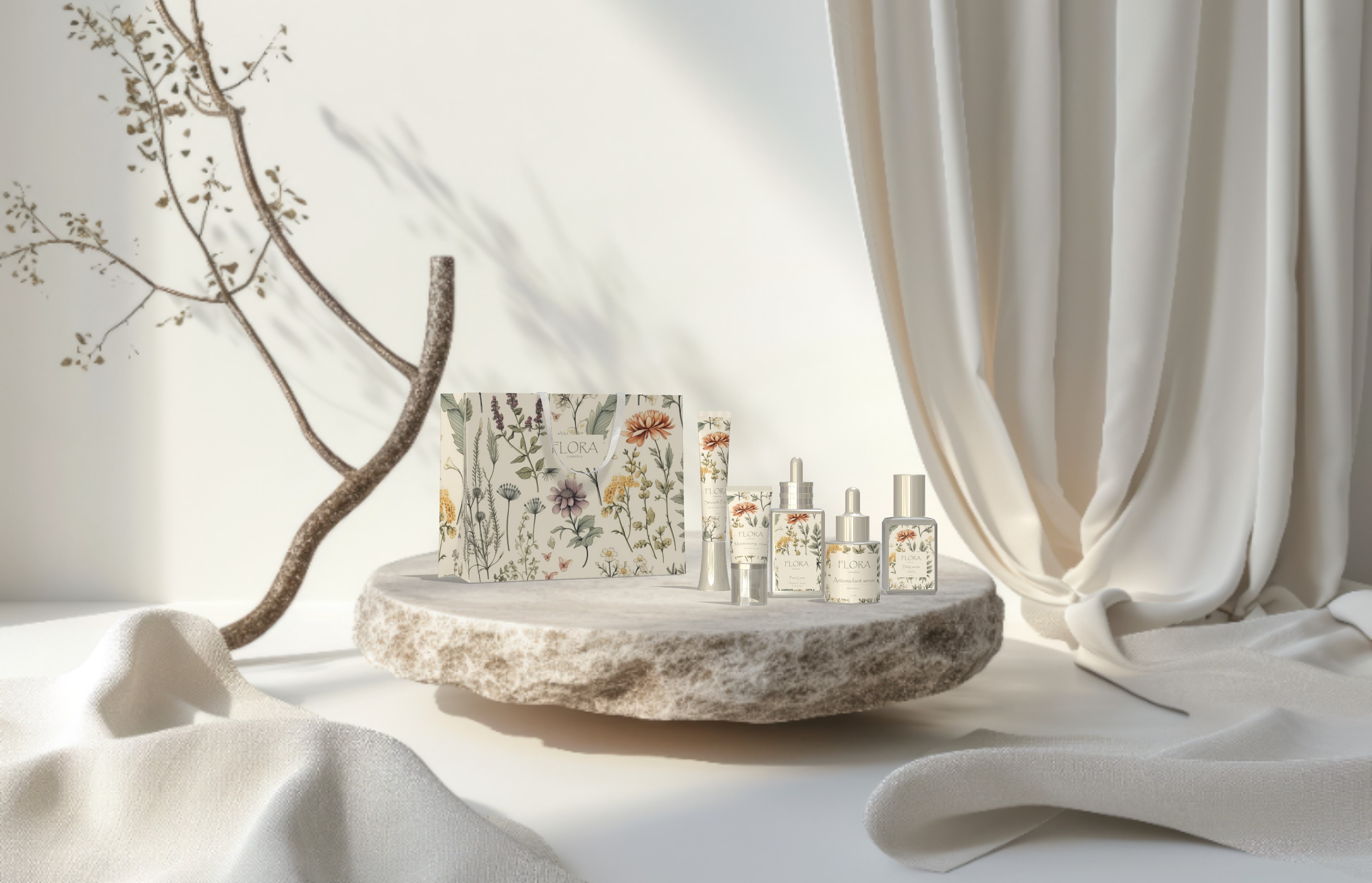
Colors: We chose a palette of soft beige, pearl white, and light olive green to convey purity, calm, and natural warmth. These colors evoke a sense of ease and approachability, in harmony with our organic product ingredients.
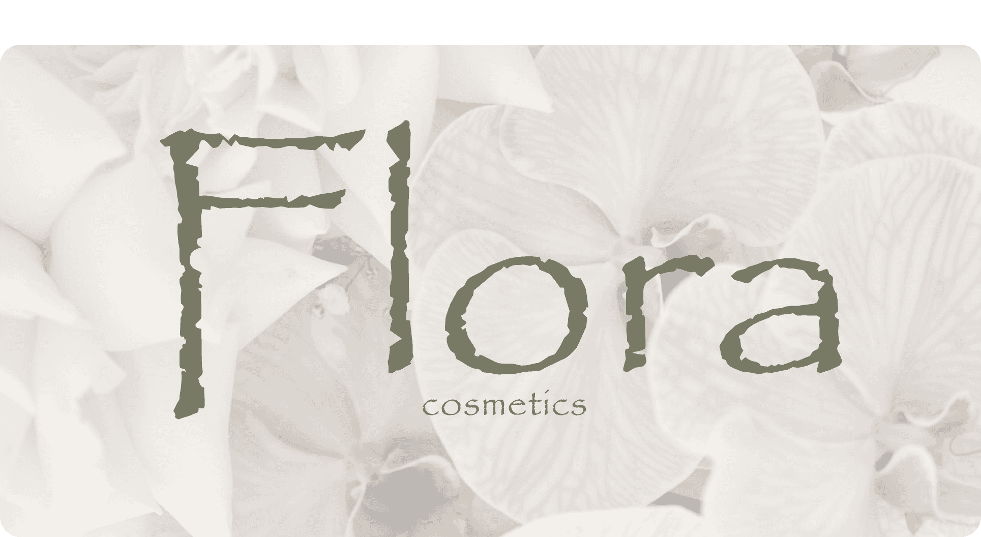
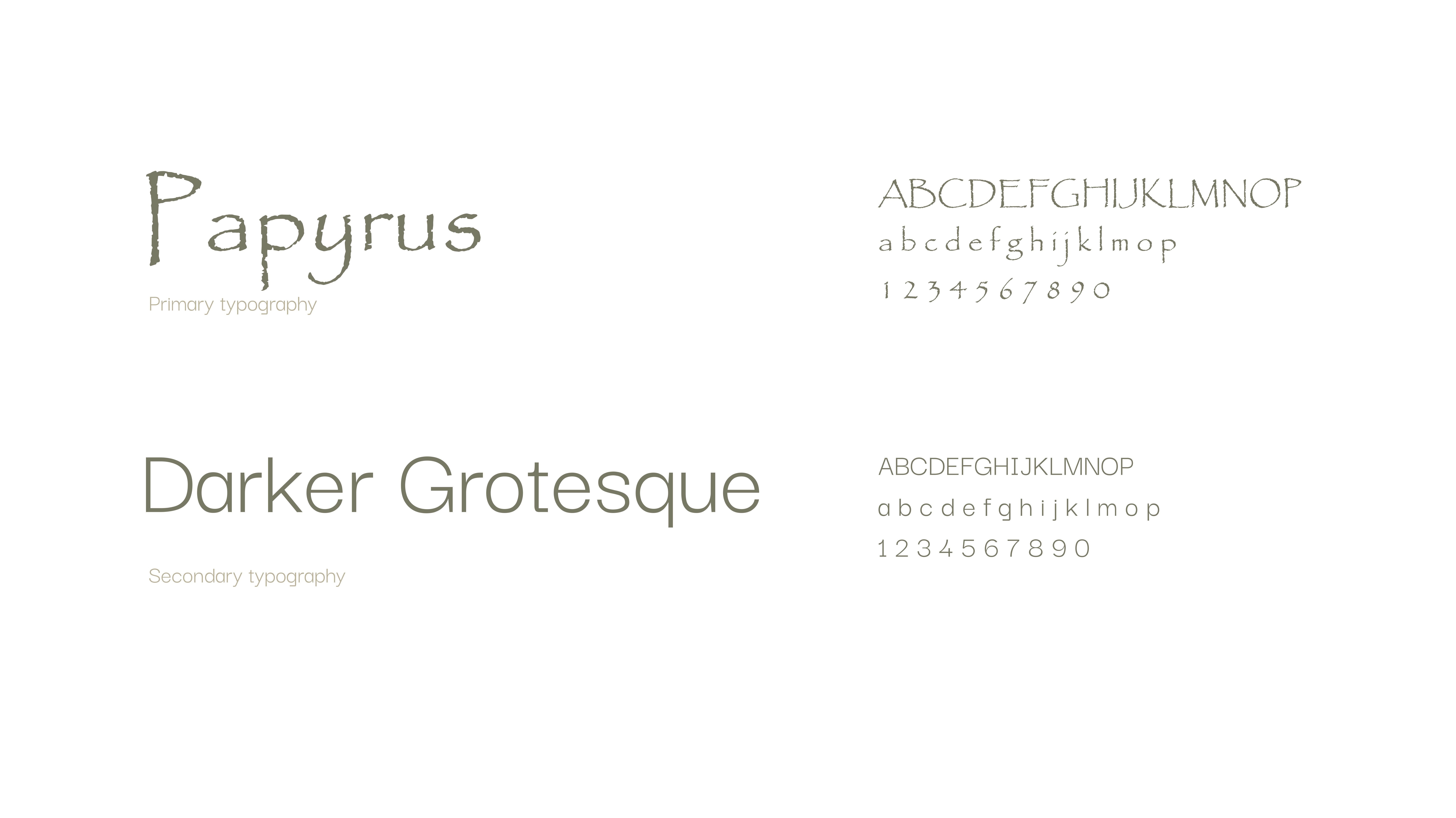
Typography: Our primary typeface, Papyrus, has a refined elegance that aligns with our natural, organic ethos, while our secondary font, Darker Grotesque, is modern and clean, balancing our aesthetic with clarity and accessibility.
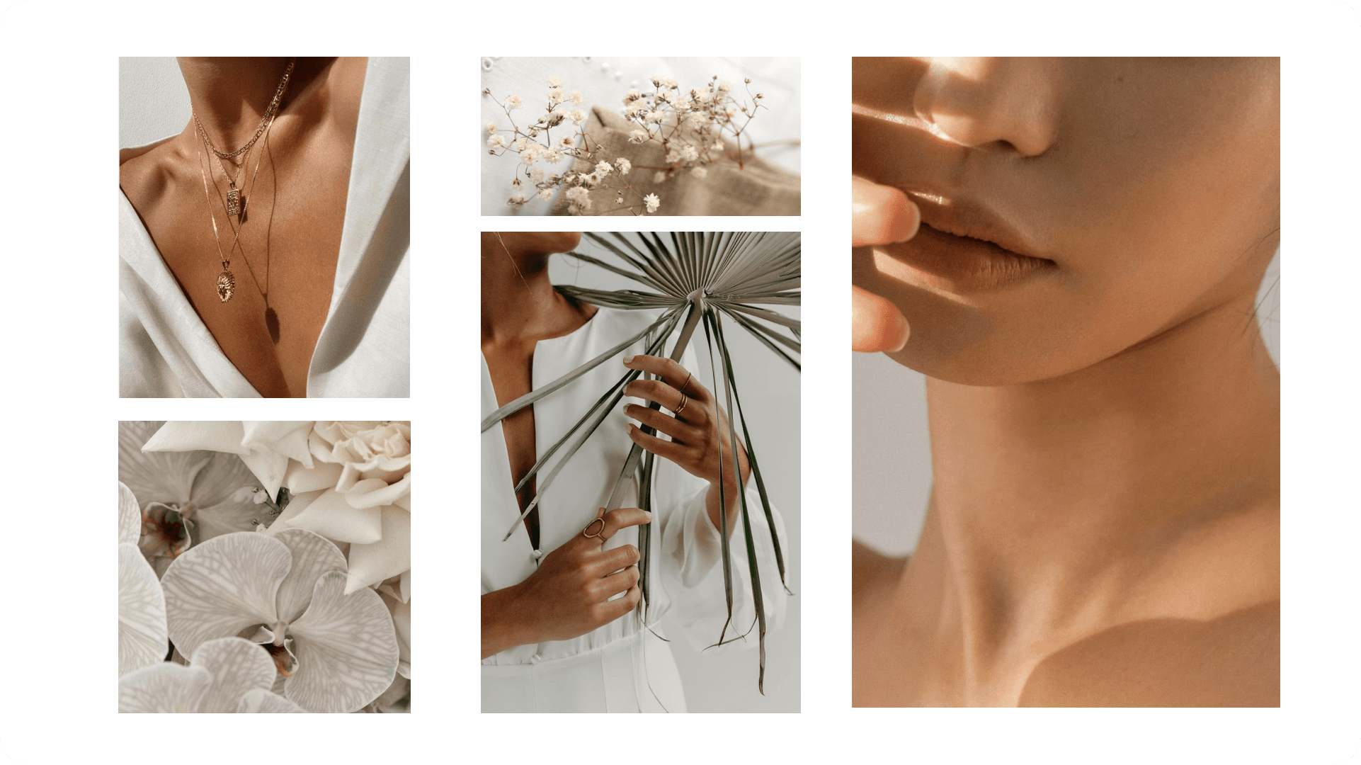
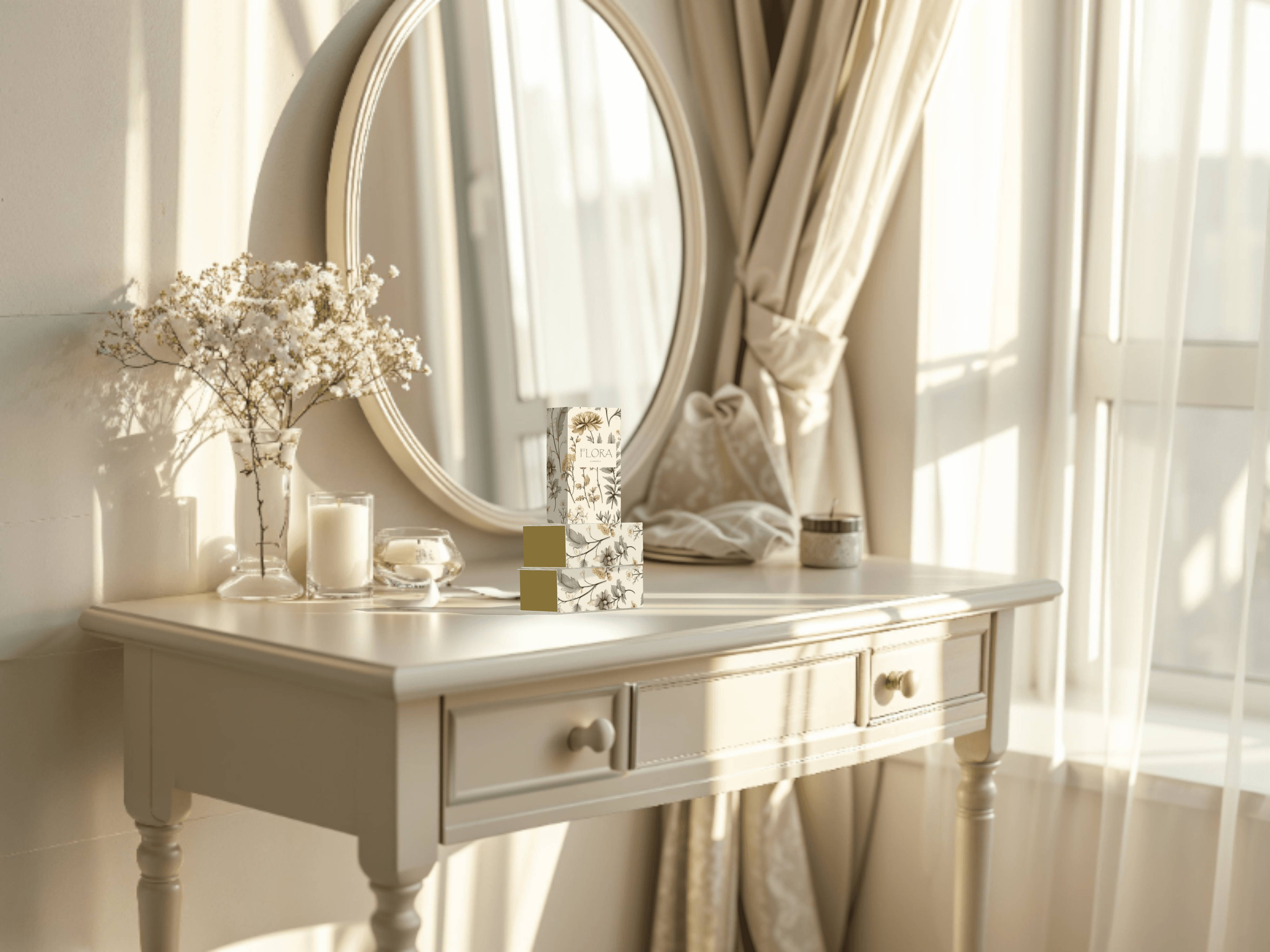
Visuals: From our product packaging to digital presence, every element is designed to feel fresh and natural. We embraced minimalism, using soft lines and gentle color transitions to reflect the simplicity and effectiveness of our products.
Design
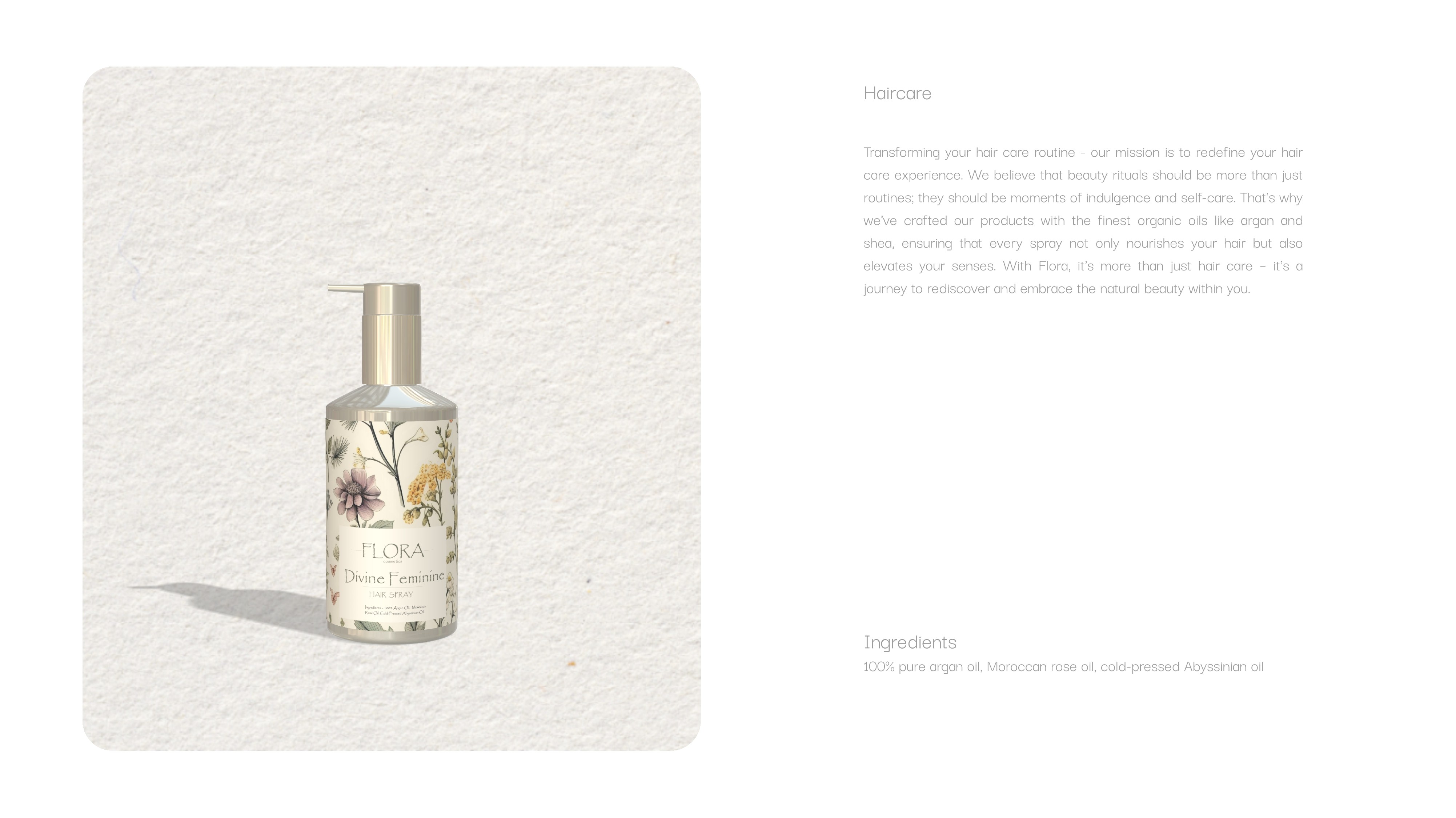
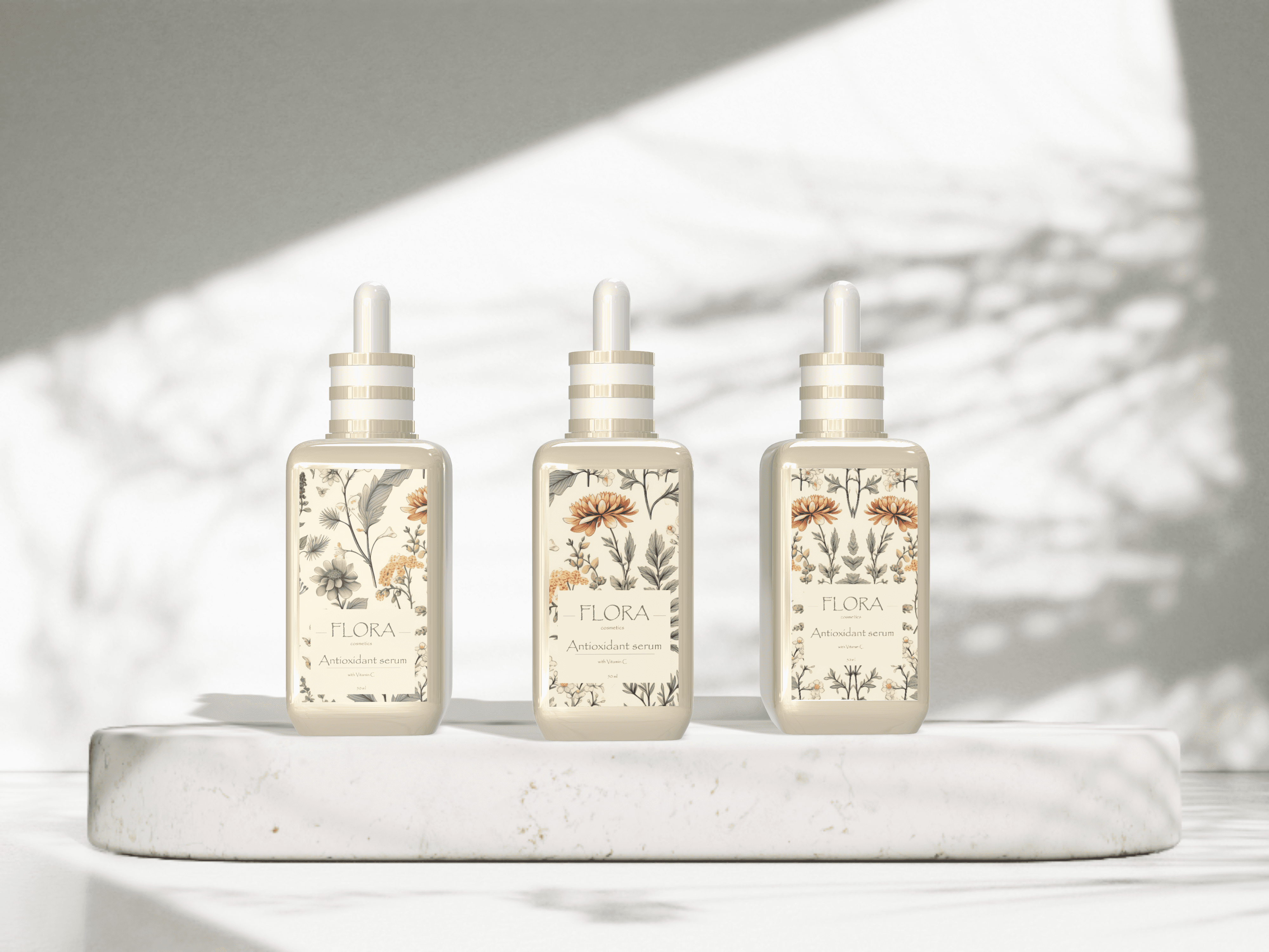
Working with our design team, we crafted product packaging and brand visuals that embody the essence of natural beauty.
Testing & Optimization
Our design was continuously refined through user feedback. We tested different packaging options, layouts, and color combinations to ensure the brand experience felt as calming and pure as the products themselves. We gathered insights on how customers interacted with our website, ensuring our visuals made navigation intuitive and effortless.
Simple Design
The clean lines, soft colors, and minimal style give our brand a natural, approachable feel that aligns with our organic ingredients.
Visual design
The look and feel of Flora Cosmetics match our values of purity, comfort, and care.
Personalization
By offering personal messages inside the package of each product, we show our customers that they are valued and appreciated from us.
Stronger Brand Connection
Customers appreciate the simplicity and natural feel of our brand, making them feel more connected to our products.
Positive User Feedback
Our packaging design has been praised for its clean, calming look, making Flora stand out in the market.
Expanding Reach
With a clear and consistent brand identity, Flora Cosmetics continues to grow, sharing our simple, natural products with people worldwide.
